An application that’s too long, too boring, and too demanding can make even the most ambitious candidate snooze.
Whether it’s a student submitting a university application, a small organisation applying for a grant, or a citizen trying to complete a government form—form submissions should be simple and painless.
A great application doesn’t just collect data—it builds excitement about the opportunity that lies on the other side.
At Submit.com, we believe smart form submissions are the cornerstone of better digital services. Here are 6 essential elements to transition your form, from good to great:
1. Personalised Question Responses
A great submission form should feel smart and intuitive.
By branching your form logically, you can personalise follow-up questions based on how applicants respond. This not only adds relevance to the process, but also shows your organisation has considered every angle—creating more meaningful form submissions.
Your form should be branched in a logical way so that if a candidate responds to a question with a particular answer, it can be used as part of a subsequent question.
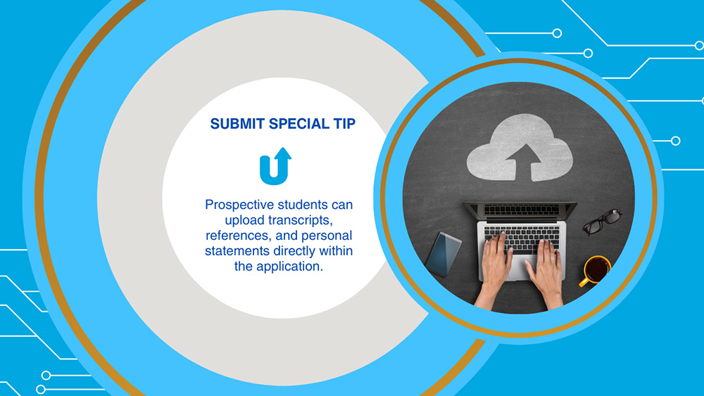
Example: If an applicant selects a specific programme or grant type, tailor the next section to ask for only the details that matter.
2. Multiple Format Responses
Sometimes life gets in the way of even the best-intentioned form submissions. Don’t let great applicants slip away.
Use automated email reminders to:
- Nudge inactive users
- Warn of upcoming deadlines
- Confirm completed applications
This not only boosts your submission rate but improves the overall applicant experience.
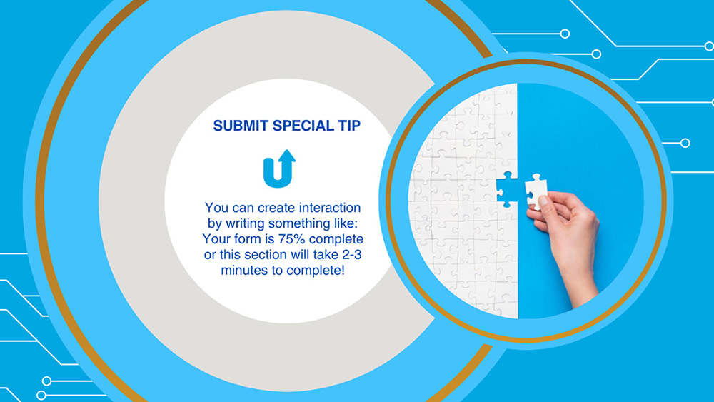
Example: A great form allows candidates to respond with a short or long text answer.
3. Upload Supplementary Information
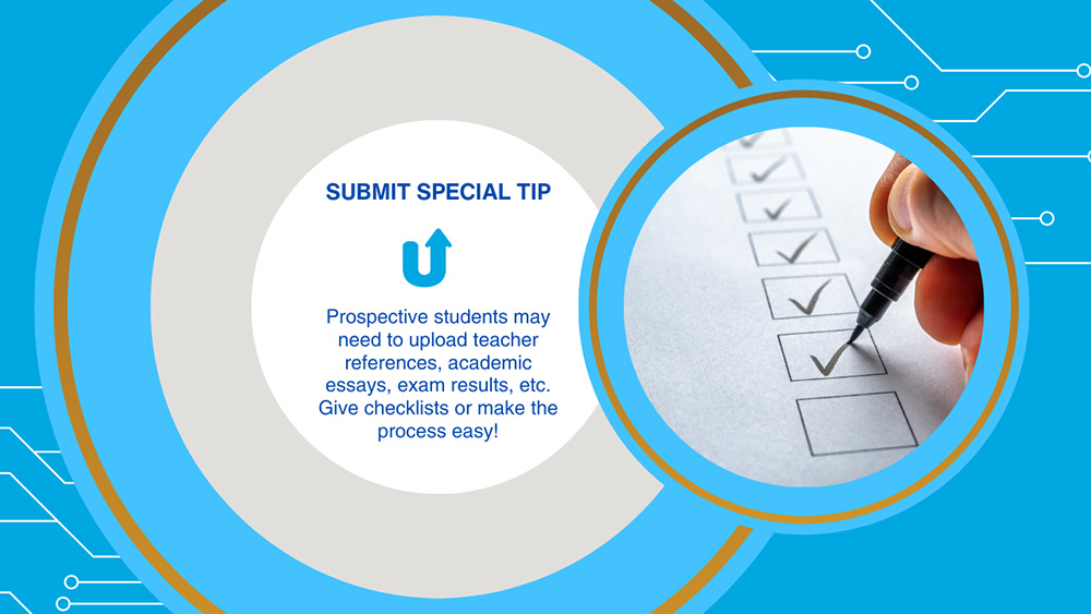
Does your application form require candidates to upload a supporting document at any point in the process? If the answer’s yes, it is vital that you make it easy for them to do so.
There’s nothing more frustrating than completing an application form then being contacted days or weeks later just to be told you need to send additional files.
A well-branded application page builds instant trust and reflects your organisation’s credibility. Your form submissions are often the first digital touchpoint—make them count.
A great application form makes the form submission process as easy as possible, and this is where you can really stand out. At whichever stage you’ll require candidates to share additional documents, make sure they can easily do that before they move on to the next stage.
Otherwise, make it easy for them to go back and upload their documents when they have finished.
E
A great form allows them to do so from within the form itself, where it gets stored directly onto their application, easy to search and open. There shouldn’t be any need for administrative teams to download every single document that candidates upload.
4. Timely and Friendly Reminders
Despite living in a totally social media-centred world, email continues to be the top choice for workplace communication, and almost a third of us respond to important emails within 15 minutes.
That’s why it’s incredibly important to send automated reminders throughout the form submission process to keep candidates on track.
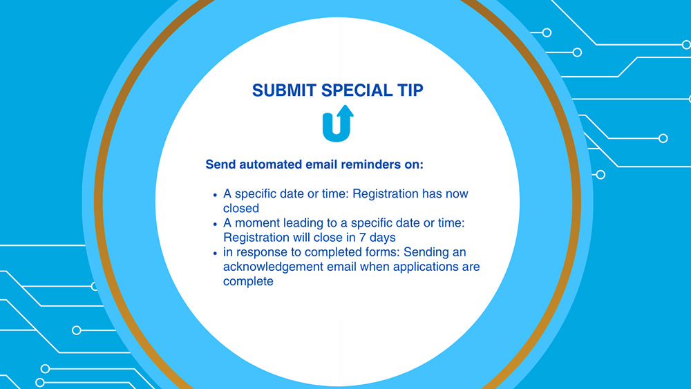
It’s not always the case that a candidate has abandoned the application, but life gets busy and sometimes, even the important tasks slip off our radar. Help your applicants stay on track by using automated email reminders at various points in the process.
You can send reminders before deadlines, when tasks or stages are incomplete, when a candidate becomes inactive, or if there are missing documents to be uploaded.
Automated email reminders aren’t just useful for applicants—internal teams can keep the review process running smoothly and make sure the process is moving as it should.
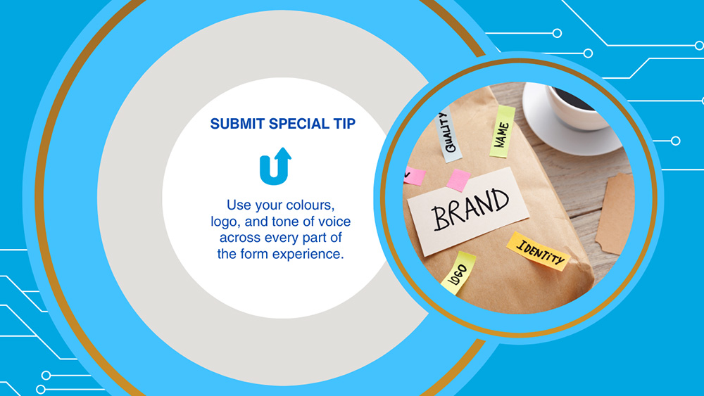
5. Branded, Distinct Form
It doesn’t matter what industry you’re in or what your application form is aiming to attract, one thing is crystal clear.
Unbranded forms can really show laziness on your part and even question your legitimacy.
Your brand identity is the face of your organisation—and if created properly, your application form can stand alone as an excellent marketing tool.
A form that’s on-brand helps build trust and credibility with your applicants and it provides the foundation for your marketing strategy.
Make sure every form you create is on-brand and recognisable—it’s usually the first point of contact applicants have with your organisation so make it count.
6. Multi-Phase Applications
Some application forms are long, and there’s not much we can do about it.
A prospective student applying for a university programme, for instance, will need to spend much more time gathering their documents, than an applicant for a TV casting call.
One thing we can do to make the process as seamless and painless as possible for the applicant?
Build a form that supports multi-phase submissions and keep candidates engaged throughout long-form applications.
A long-form application doesn’t need to be a boring one—by implementing a phased approach, not only does it separate sections of the form, but it also helps candidates feel that they are progressing through the application.
You might include a phase that asks candidates to upload a video, for example, so they can better showcase their suitability and let their character shine through.
You could add a survey towards the end of the application, or dedicate an area for uploading additional documents. However you decide to organise it, building phases of the application is a great way to keep candidates engaged and moving forward.
Discover Submit.com Forms
It’s a fact. Nobody likes lengthy, complicated application forms. So, why are so many applications still so tedious to complete?
Whether it’s a job, university or grant application, most forms are boring, take ridiculously long to complete, and demand an extreme amount of time and energy, with what can essentially be met with absolutely nothing.
That’s why Submit’s customers make full use of the smart form builder within the platform.
There’s no need for coding or design skills because everything is pre-prepared for you, all you need to do is customise it so that it’s perfect for your organisation.
If you want to know more about how Submit can help you build engaging and smart forms for your next call to submissions, get in touch or get started on a free demo to test it out for yourself.
It’s the easiest way to engage applicants right through to the end of the process and beyond!


0 Comments